

You’re looking for a website for your business. You don’t just want any website, you want it to look professional – it is part of the public face of your company after all, and if you want people to see your company as professional, your website had better look professional. If you’re thinking along these lines, you are on the right track, but there is a massive distance to cross from wanting a professional grade website and having one, so let’s look at some key factors you need to consider in making your website look professional.
The Basics
These are the core basics of any website or really any communications tool. If these are out, nothing else really matters.
Consistency
 The toy company Lego mastered the art of consistency in their signature plastic blocks. You could take a lego block from 50 years ago and use it with one made just today, and they’d still fit perfectly. Why? Lego understands the need for consistency and standardization. Any Lego block will work with any other Lego block.
The same goes for your website. No matter what page a visitor is on, no matter where on a page a visitor looks, they must always feel like they’re on the same website. As soon as you introduce a jarring change, people will wonder if they’re still looking at the same company, and you’ve just created a disconnect, and will lose many of your visitors right there. Just like if Lego changed the pattern for their plastic blocks, that block from 50 years ago wouldn’t work with a new block that’s done differently. They just won’t fit.
Readability
 You must make sure your text, or copy as it’s called in the business, is readable. This means choosing a font type that’s easy to read on both computer and mobile screens. Sans-Serif type fonts like Ariel usually work the best for this.
You also need to choose a font size that your viewers can comfortably read on a screen. Avoid making your find too big or too small, or reading your website will become a chore. Usually a point size of about 12-14 is good for a font like Ariel, but if you’re using a different font, you may need to adjust this number as some fonts are naturally bigger then others. If you’re unsure, test it out in a word processor and try experimenting with different fonts and sizes, or keep it simple and just go with Ariel 12-14 pt font.
Contrast
Another 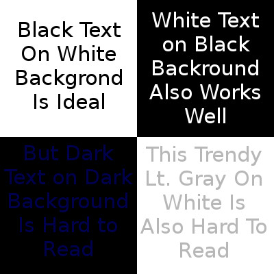 key to readability is contrast. If you don’t have enough difference in shade between your text and your background, people won’t be able to properly see your text, let alone read it. It might seem stylish to put that light gray text on that white background in that fancy script font, but if nobody can read it, what good does that do you? The rule of thumb here is dark text on a light background or light text on a dark background.
Background Images
Another issue is image backgrounds, which are quite popular, and this can be great if properly done, but it does add a new set of challenges, an image such as a photo, has an uneven background. For example, a photo could have areas of light daytime sky, and dark green foliage from trees in the background. This makes it hard to choose the right colour for your text to stand out against a some places light, some places dark background. A good web developer can do a workaround for this, and the solution I usually use is putting in a transparent background wherever there is any text. That way you can have your cool photo background, your flashy headline, and people can see it all too!
Navigation
 Whether you’re doing a one page site, or multiple pages, people will still need to be able to quickly find specific information on your site. This means having a navigation system that’s intuitive and readily accessible to take people right to the page or section of a page where the info they’re looking for is. The standard way of doing this is having a main menu, with in text links strategically placed where appropriate. You need to plan it out, too many links and you can easily confuse people with too much information and too many choices. Too few links, and people have to search to find what they need. Either of these will lead to many people leaving your site and looking elsewhere for help.
Having menus here, there and everywhere will also confuse visitors, as they’ll have no idea where to look to find links to more information. You again create disorganization and confusion. So keep your menus well-organized, with a clear placement on all pages, and a clear structure so people know where to find every page or important section on your website.
Conversions
Once you have the basics set, then it’s time to look at conversions. Your website has a purpose, and at least one action you want your visitors to take. So plan it out. What is the ultimate purpose for you website and what action do you want visitors to take? Then you need to create the copy, graphics, design and layout that will best engage your visitors, and guide them to that action you want them to take, and inspire them to take it.
Conversion Goal
 This is the main purpose of your website and the action you want visitors to take to achieve that purpose. This could be to subscribe to an email list, call your office, visit your storefront, or purchase a product online. Really, it’s whatever visitor action achieves your goals best.
The best way to work out what your conversion goal needs to be is look at what product or service you offer, and what pain point or problem it solves, and what action is the most appropriate to get your visitors to your solution.
Headline
The first thing anyone sees on screen should be your headline. This is where you present a problem and propose your solution. Keep it short and sweet. You don’t need details here, they’ll go below where you provide your solution and supporting evidence.
 Call To Action
This is where you tell the visitor what to do next. It’s a good idea to have a call to action right below the main headline, as some people will be sold by the headline itself, so give them a quick and easy way to take action right away. Then repeat it again every 2-3 screens worth of scrolling so no visitor has to scroll too far to find the next call to action once sold. The more delay you enter into the picture, the more chance there is that the person will talk themselves out of your solution.
The more complexity and confusion you enter into the process, the more likely your visitors won’t understand your solution, it’s benefits or what exactly it is you wan them to do, so the more likely they’ll be to just leave and look elsewhere for their solution. So keep your calls to action simple, relevant and and easy to find and identify. That way, your visitors will see a solution to the problem that lead them to your website and a simple way to get access to it.
Offer
 Your call to action and headlines need to present an offer. This is in part your solution, and in part how to contact you to get it. This can also include bonuses or gifts to entice them further, in fact a well planned bonus or gift attached to an offer can do extremely well for your business. Your Offer can be as generic as a “call us at xxx-xxx-xxxx to find out more,” or as creative as “call us now to reserve your free 1 hour consultation – we only have a limited number of spaces available so don’t delay.”
What it all comes down to is everything from the overall look and feel of your website to the contents to the flow of traffic through your website all contribute to make it look and feel professional, or look and feel amateur.
If you have any questions or ideas you want to share, feel free to leave a comment below. I do read them and love to hear from you, and your questions will help me help you by telling me what parts of this article you need me to expand upon and explain in more detail.
Thank you all for reading and I hope you have a wonderful day.


Comments on this entry are closed.